
.svg)
SMART IRB
Streamlined, Multisite, Accelerated Resources for Trials IRB Reliance platform
Simplifying Multisite Research Workflows to Reduce Support Burden
NCATS, NIH

Impact at a Glance
30%
25%
20%
20+
100%
Executive Summary
SMART IRB is a national platform that supports institutions and investigators in implementing the NIH Single IRB (sIRB) Review policy. The system enables collaboration across organizations nationwide and plays a critical role in advancing multisite research.
Despite its importance, the platform’s complexity created usability challenges. Users struggled to navigate multi-step workflows, understand process status, and complete tasks without assistance. This resulted in heavy support volume and operational strain.
The goal was clear: create a structured, intuitive, and self-service experience.
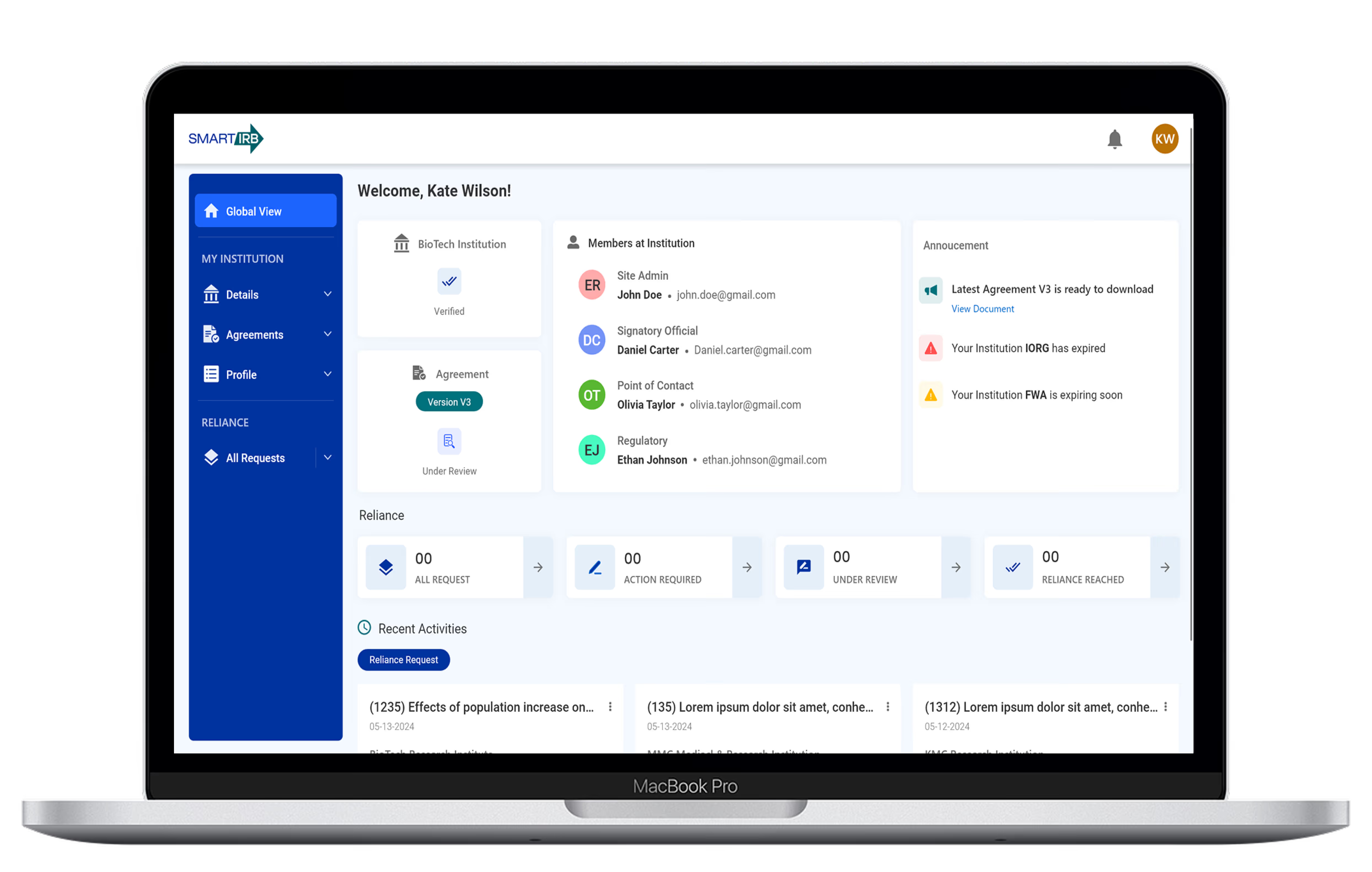
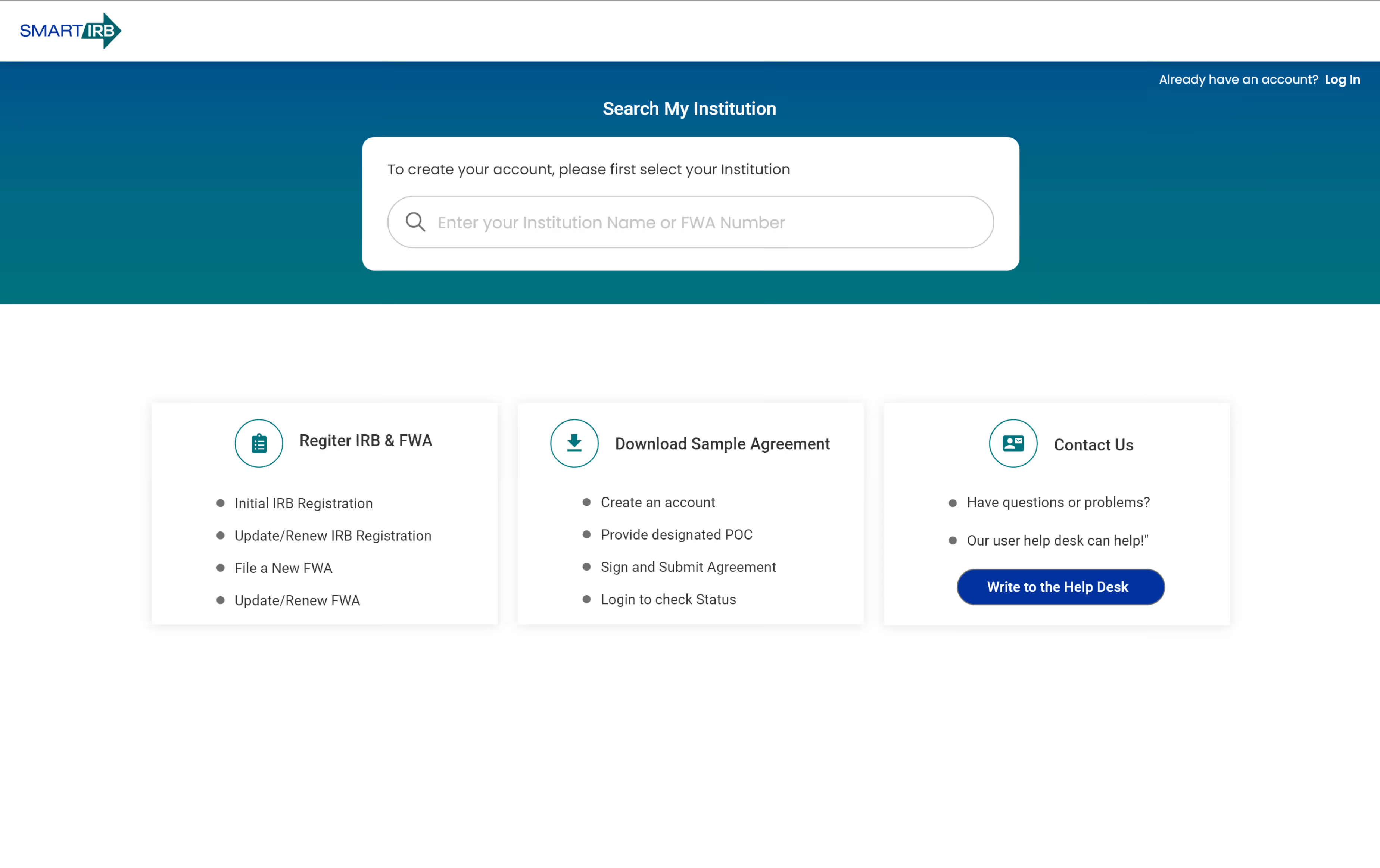
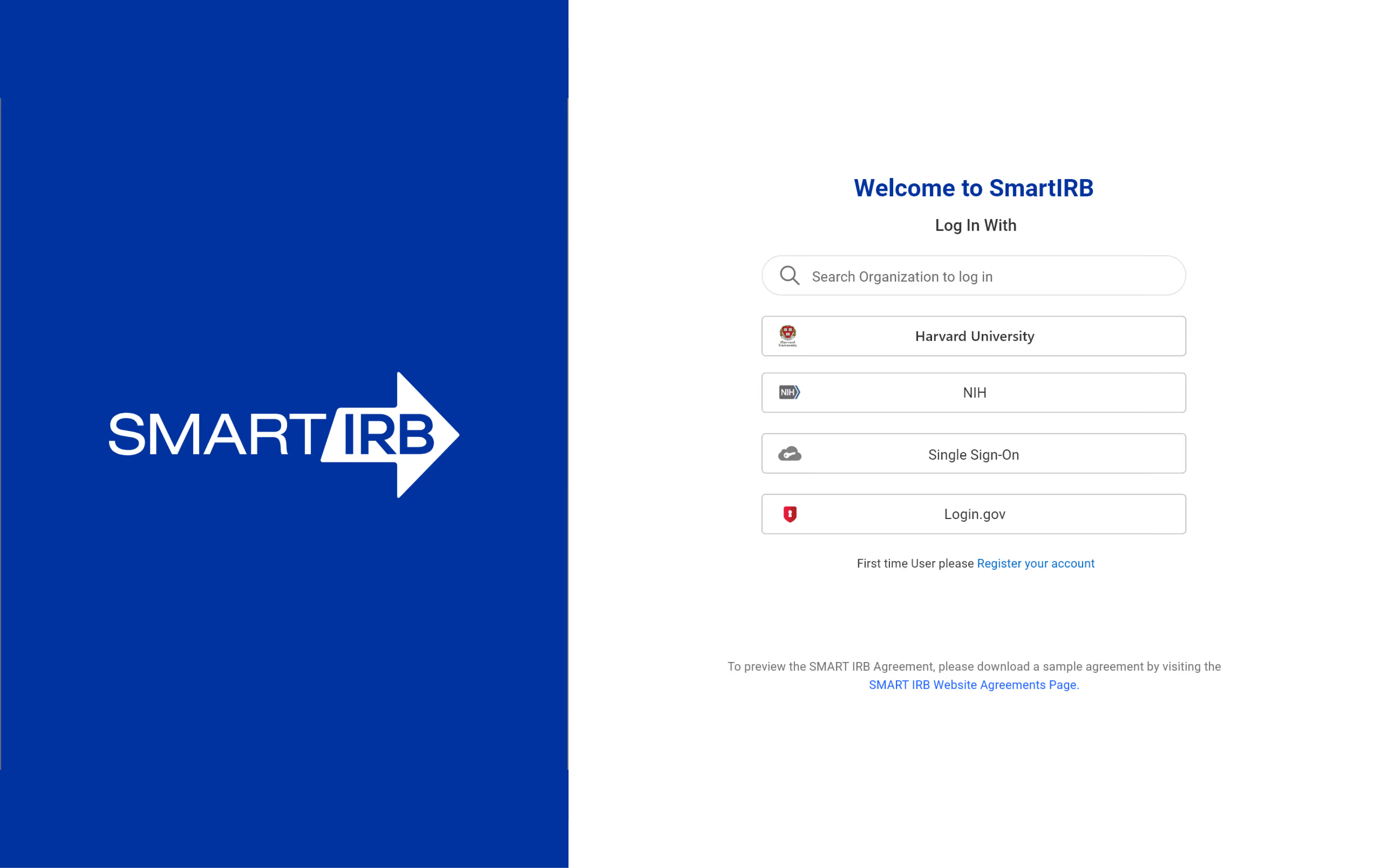
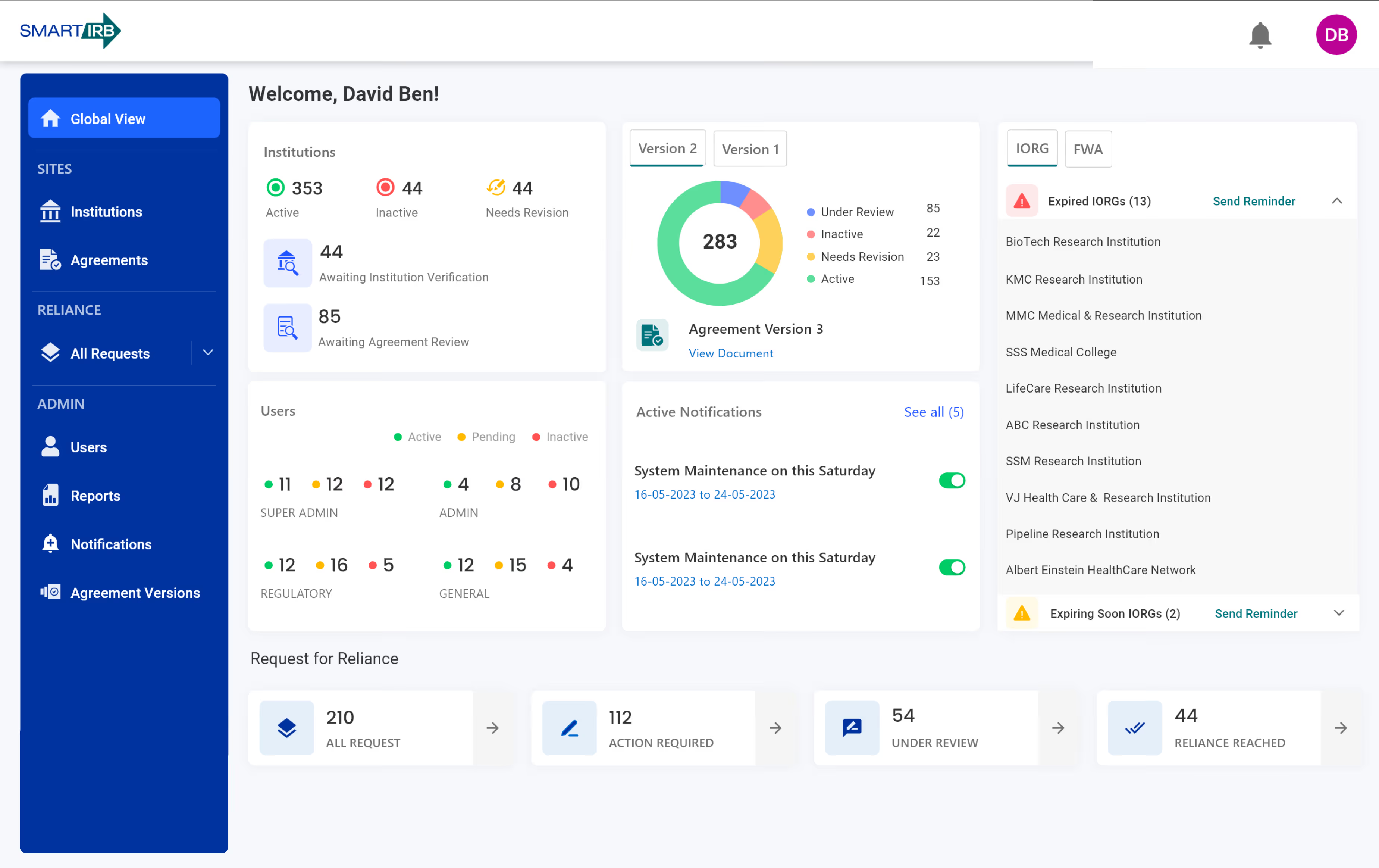
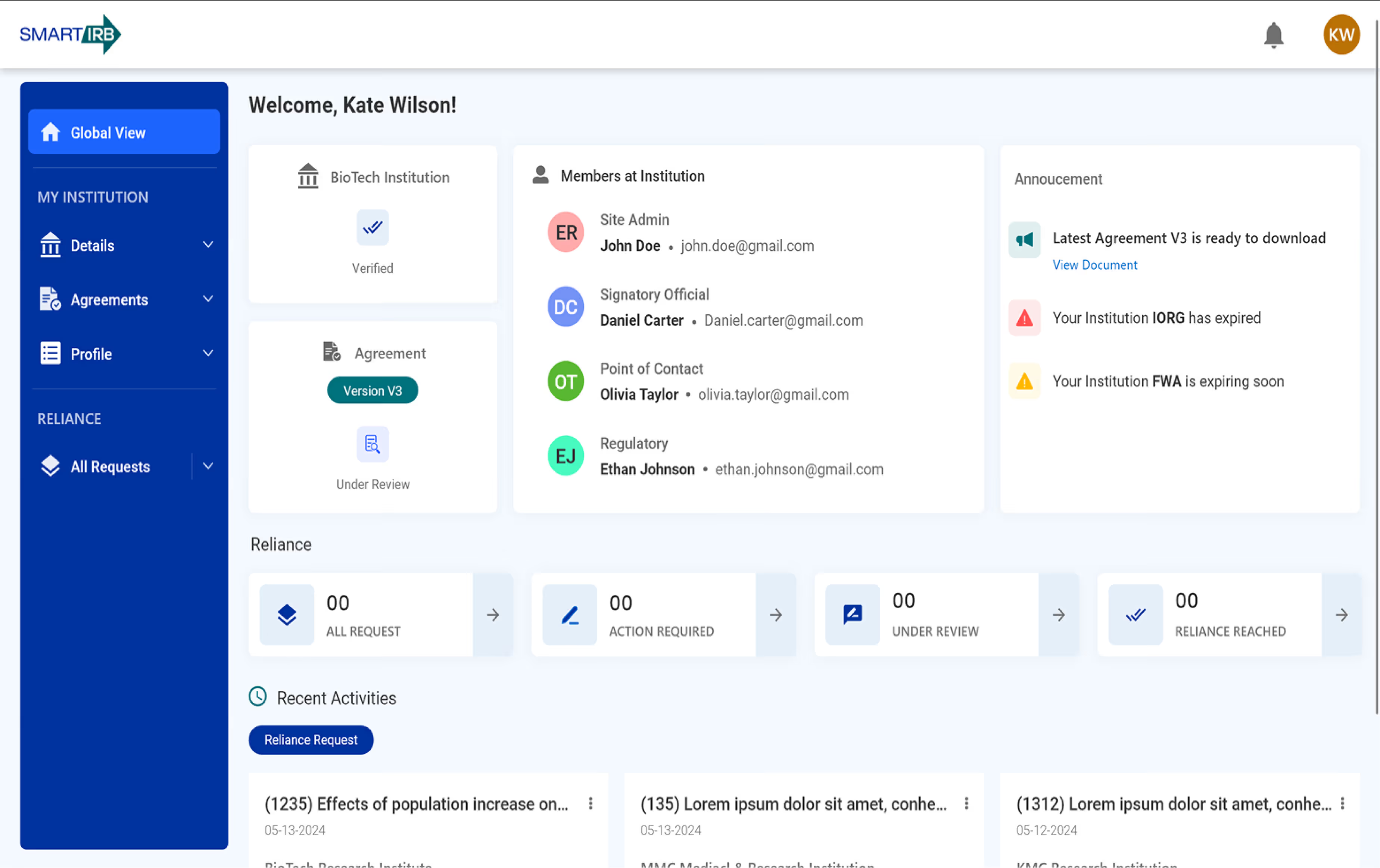
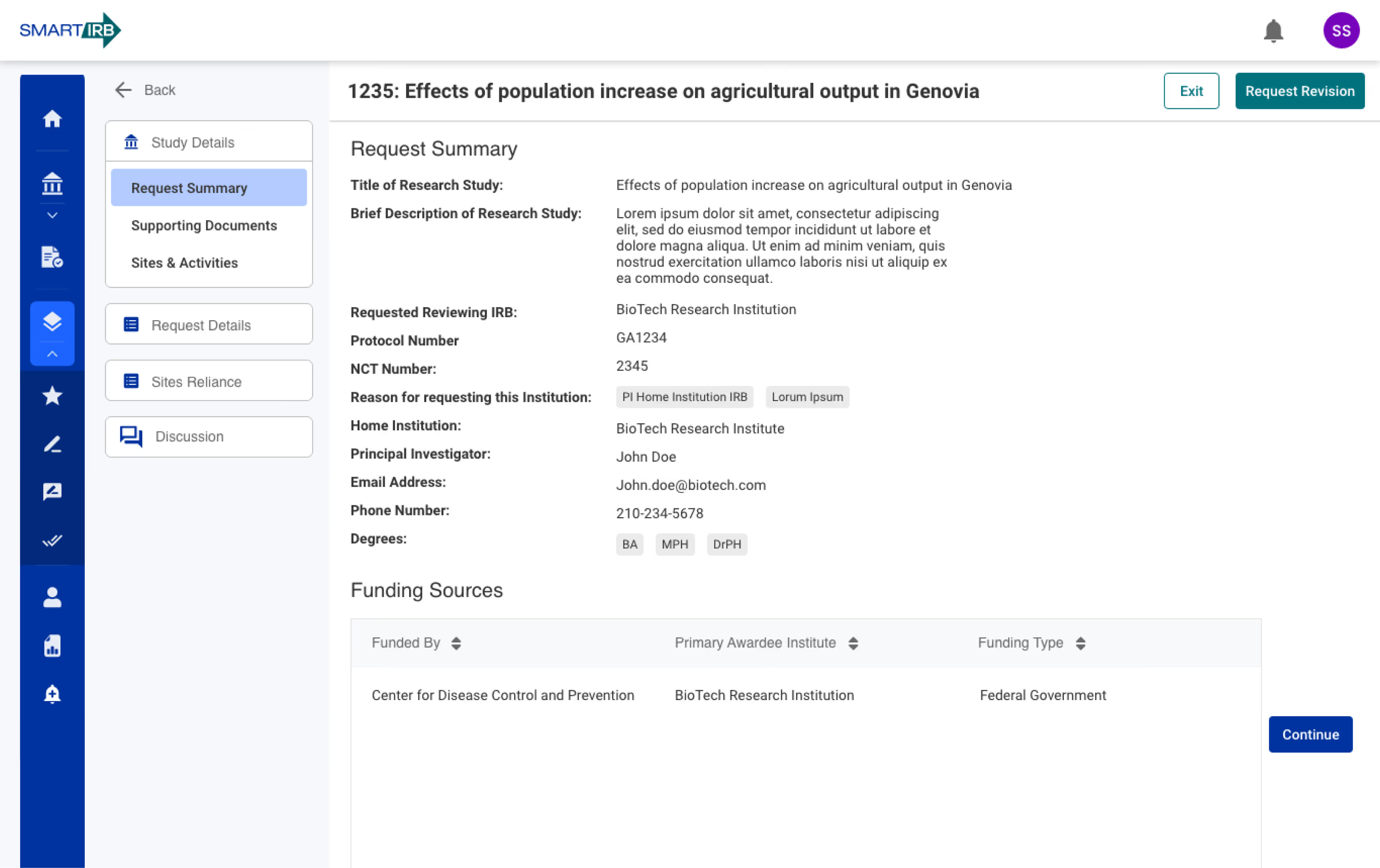
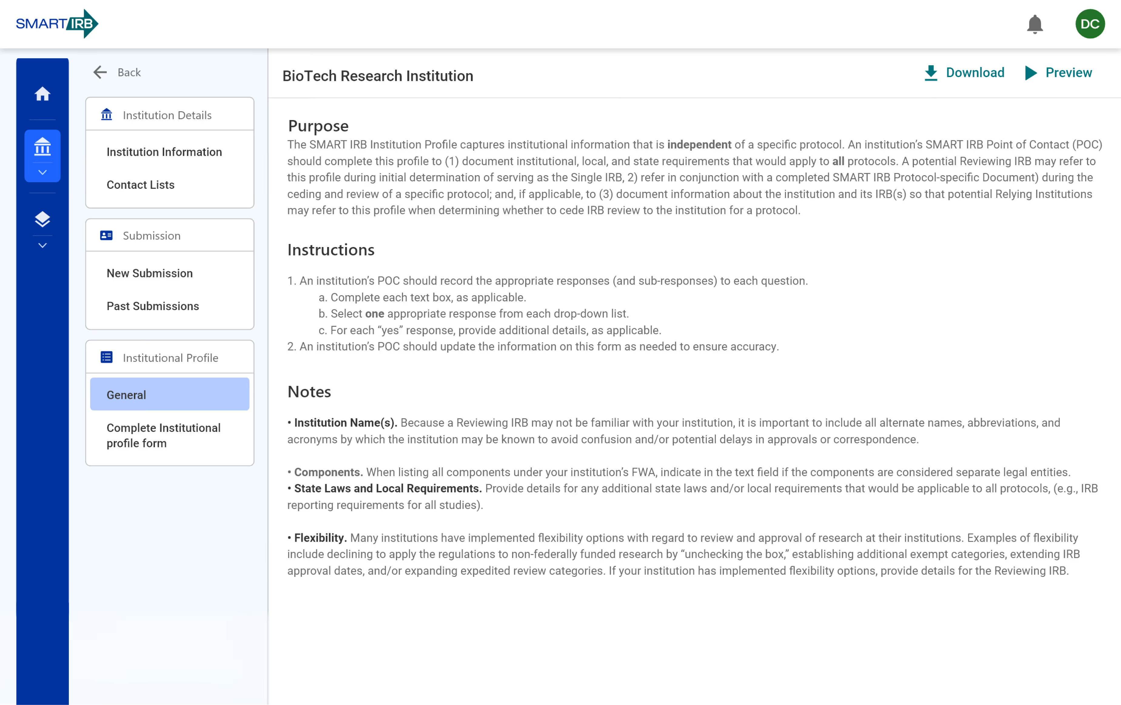
THE Problem
Users frequently struggled to:
Understand where they were in multi-step workflows
Identify next steps and required documentation
Navigate between modules confidently
Understand where they were in multi-step workflows
This led to:
High email-based support volume
Slower workflow completion
Increased frustration
Operational inefficiencies
Design Challenge
How might we simplify complex IRB workflows and introduce structured clarity within a regulated enterprise system so users can complete tasks independently and confidently?
My Role & Leadership
As UX Design Manager, I led UX strategy and execution across the platform.
Strategy
Defined the UX vision and measurable success criteria
Established clarity-driven design principles
Aligned UX goals with regulatory and operational realities
Leadership
Led and mentored UX designers and researchers
Facilitated stakeholder alignment and cross-functional critiques
Served as the bridge between business, research, and engineering
Execution Oversight
Validated usability and accessibility standards
Ensured consistency across 20+ modules
Established reusable design patterns and systems
I guided the transformation from fragmented workflows to a cohesive enterprise UX foundation.

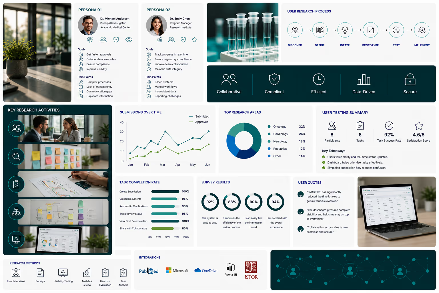
Discovery & Insights
To reduce support dependency, we investigated where users experienced friction.
KEY Insights
The root issue was not missing features — it was missing clarity.
01
Users lacked visibility into process status
02
Terminology and navigation were inconsistent

03
Forms were long, repetitive, and error-prone
04
Internal users needed faster scanning and filtering tools
05
Different user roles required different mental models
UX Strategy & Information Architecture Transformation
This strategy enabled scalable, role-based systems that reduce complexity and improve usability.

Strategy 1
Make progress visible at every stage
Strategy 2
Reduce cognitive load in complex workflows
Strategy 3
Introduce role-based navigation and task orientation
Strategy 4
Design once, reuse everywhere
Strategy 5
Treat accessibility as a foundational requirement
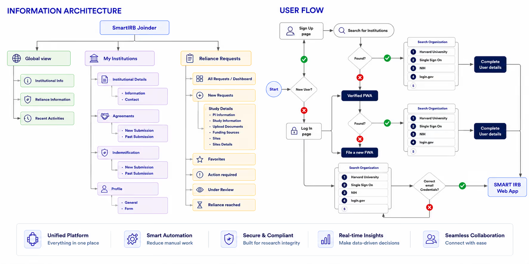
Information Architecture & User Flows
We restructured the platform around how users think and work.
Outcomes
Navigation and workflows shifted from fragmented to structured and role-based.
40–60% reduction in navigation complexity across workflows
Clear task progression with defined next actions
Improved visibility into submission, review, and approval status
Standardized flow patterns across 20+ modules
Reduced backtracking and navigation errors
Consistent experience across investigator and administrative roles
Scalable IA supporting cross-institutional workflows
Interaction Design & Workflow Simplification
With structural clarity established, workflows were translated into guided, intuitive interfaces.
Key Deliverables
Low- and mid-fidelity wireframes
Redesigned forms with inline guidance and validation
Clear task states and progress indicators
Improved table layouts for scanning and bulk actions
Design Focus
Reduce ambiguity
Surface help at decision points
Guide users forward without overwhelming them
Design System & Component Foundation
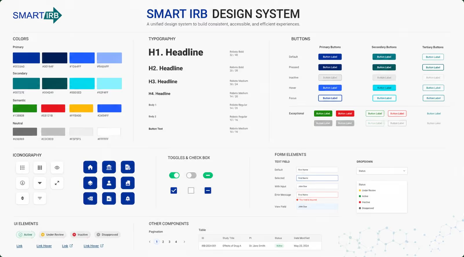
To ensure long-term scalability and consistency, we established a foundational design system.
Core Components
Buttons, inputs, tables, modals
Status indicators and system feedback
Error handling and empty states
Accessible color, typography, and spacing standards
Impact
Accelerated delivery across modules
Strengthened cross-team alignment
Embedded accessibility as baseline
Enabled consistent enterprise-wide experiences
Usability Testing & Iteration
Designs were continuously validated and refined.
Approach
Task-based usability testing
Heuristic validation
Iterative refinement based on observed friction
Improvements Observed
Fewer steps in critical workflows
Reduced input errors
Increased navigation confidence
Greater task completion independence
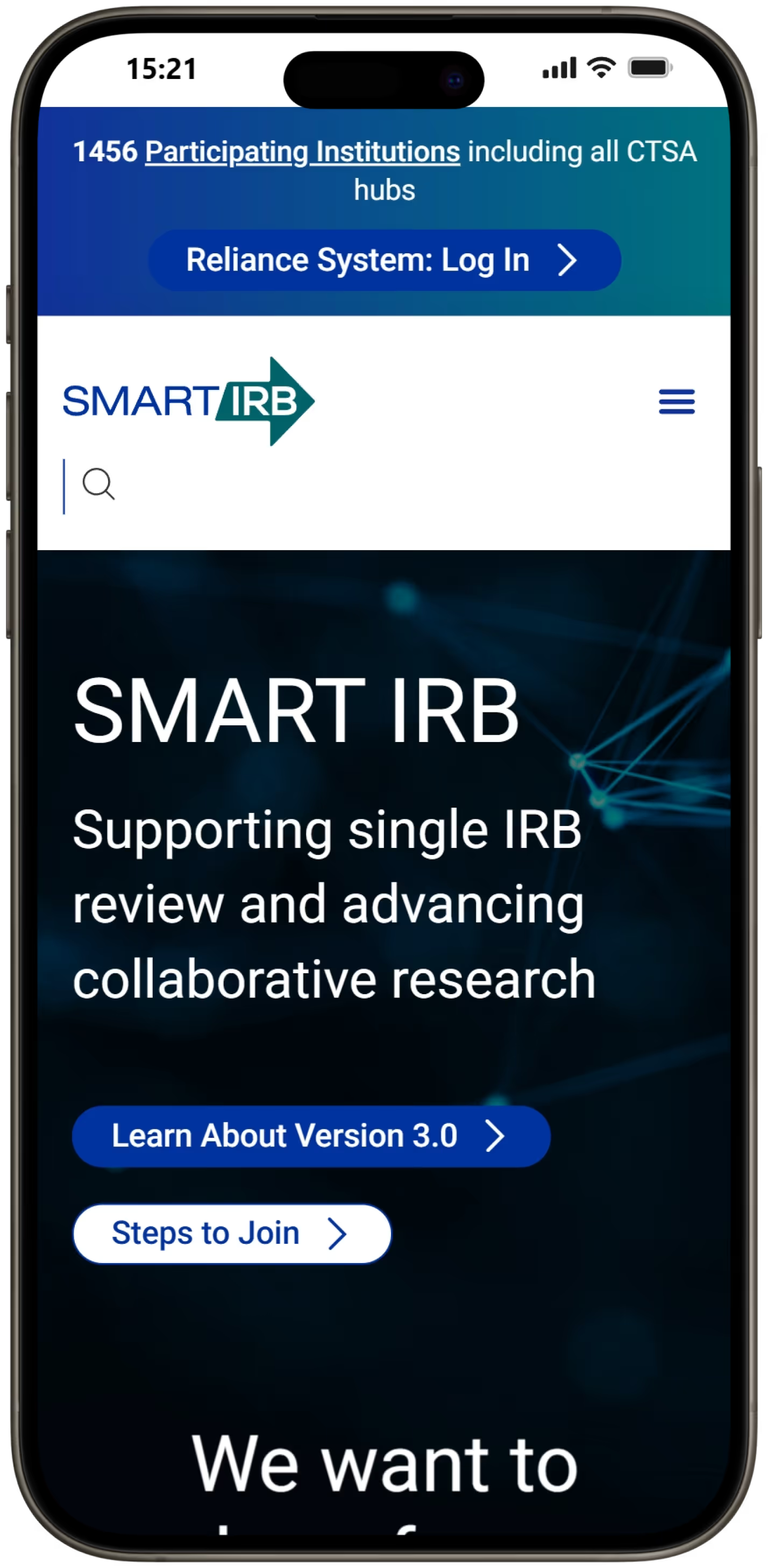
Outcomes & Organizational Impact
The transformation improved both user experience and operational efficiency.
The result was not just interface improvement — it was organizational impact.
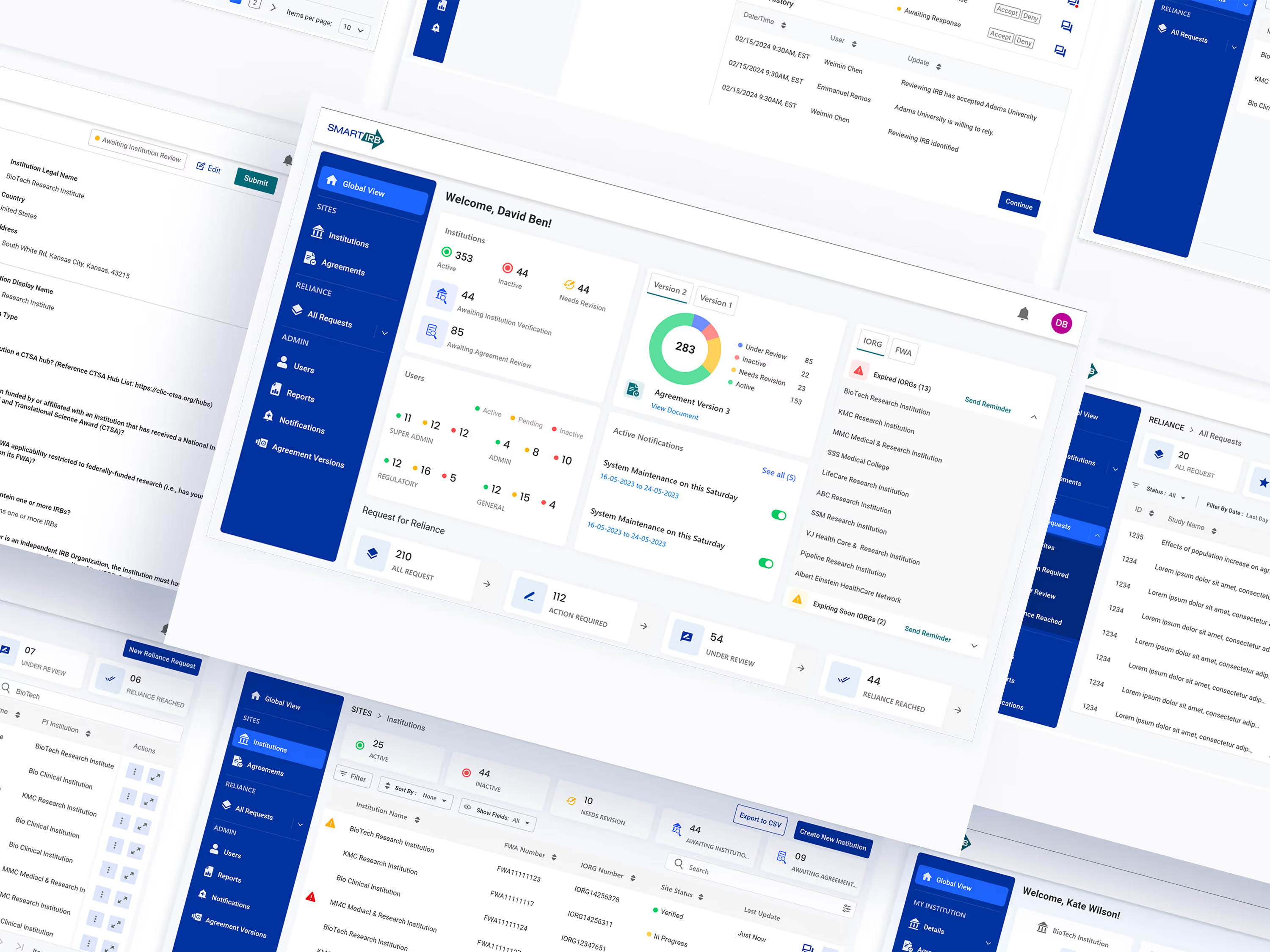
Visual Transformation
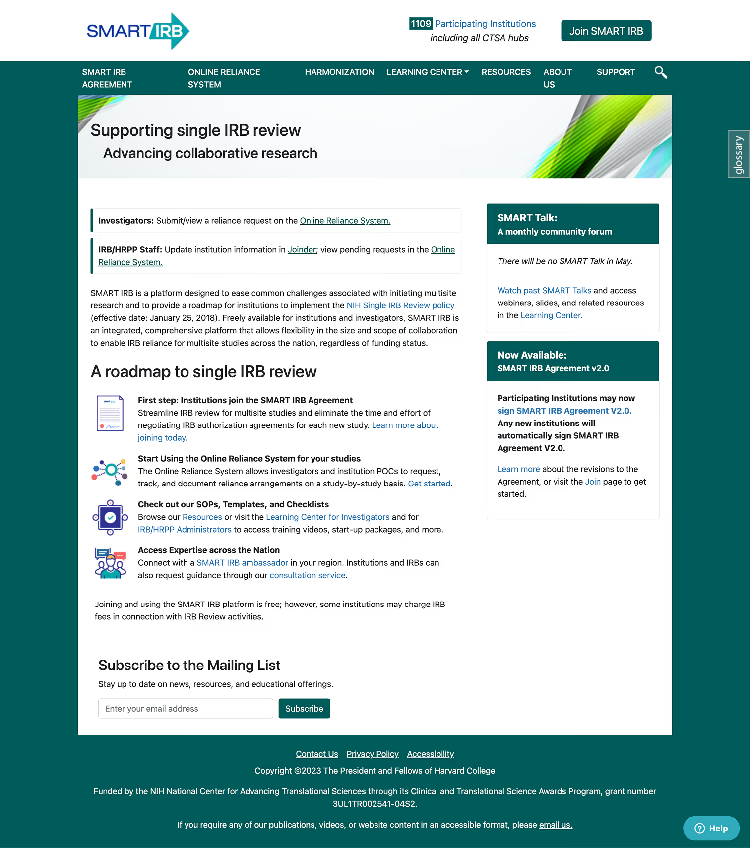
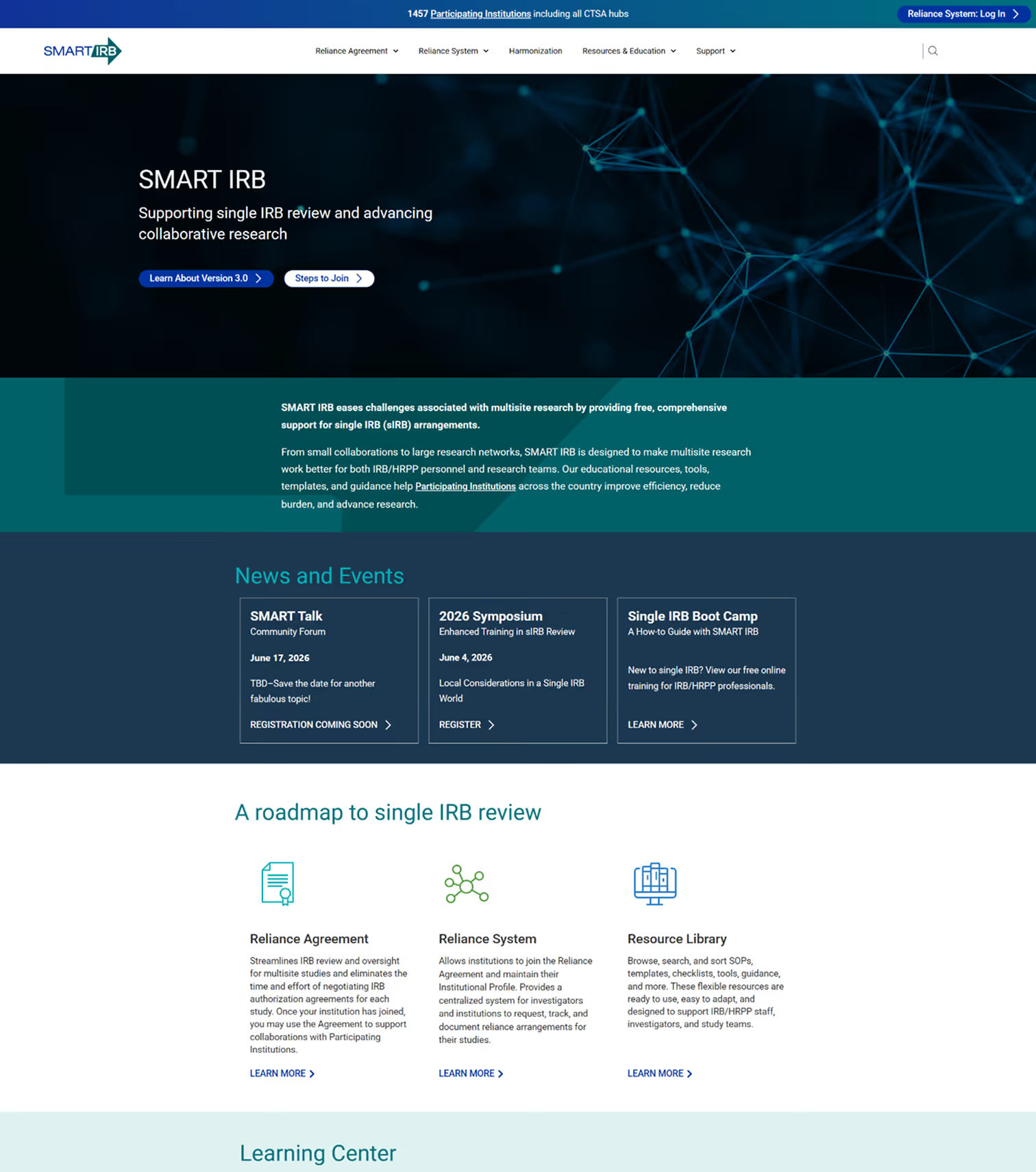
By aligning research insights, regulatory requirements, and scalable design systems, we transformed SMART IRB into a more intuitive, self-service platform — benefiting users while reducing operational burden.
This work reflects my ability to lead systems-level UX transformation within regulated, enterprise environments.

If you're building complex platforms, modernizing systems, or strengthening UX leadership, I'd welcome connecting.
