
.svg)
GARD
Genetic and Rare Diseases Information Center
Transforming Rare Disease Information into a Scalable, Patient-Centered Digital Platform

Impact at a Glance
+11.5%
+10.4%
90%
60%
+10%
+2.9pt
100%
Executive Summary
The Genetic and Rare Diseases (GARD) Information Center serves millions of patients, caregivers, advocates, clinicians, and researchers seeking trustworthy rare disease information. Years of incremental updates had led to structural fragmentation, inconsistent content models, declining SEO authority, and growing accessibility risks. Over a three-year engagement, I led the transformation of GARD from a fragmented legacy system into a research-validated, responsive, accessibility-first digital platform supported by a scalable UX governance model.
This was not a redesign — it was a multi-year UX maturity program.
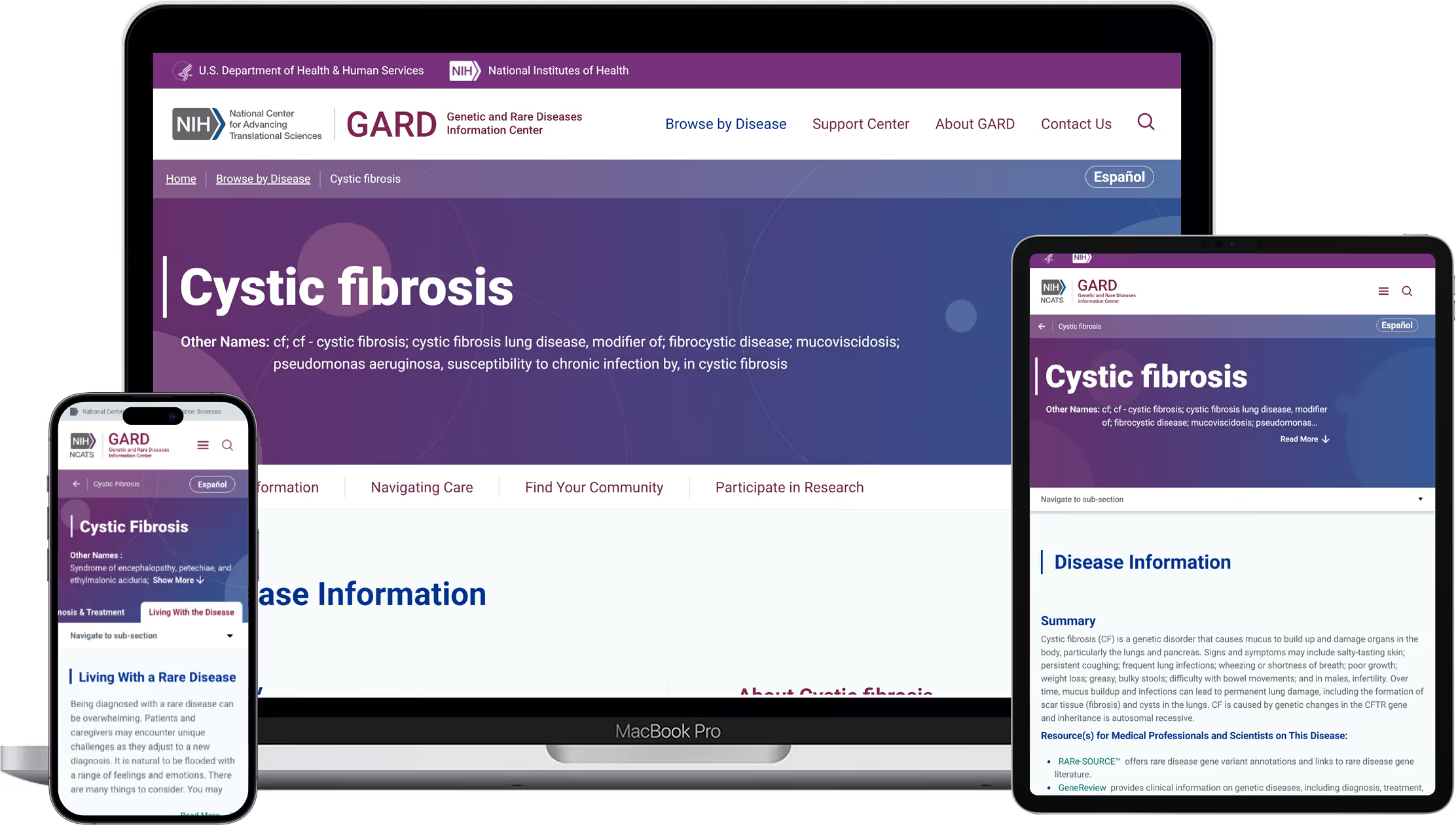
THE Problem
Research and analytics revealed systemic barriers preventing users from accessing critical health information efficiently.
Users often arrived during moments of emotional crisis. The platform needed to reduce cognitive load — not add to it.
Core Challenges
Poor discoverability
Dense, overwhelming text
Confusing medical terminology
Fragmented resources
Hard-to-print disease pages
Incomplete content transparency
Declining SEO performance
Design Challenge
How might we realign GARD's information architecture with user mental models while modernizing usability, accessibility, scalability, and measurable performance?
My Role as UX Design Manager
I directed the full lifecycle transformation — from discovery to post-launch optimization.
Leadership Responsibilities
Owned UX strategy and roadmap alignment
Directed mixed-method research program
Governed GARD 2.0 design system standards
Led stakeholder alignment with NIH leadership
Established documentation, QA, and accessibility checkpoints
Balanced roadmap priorities and cross-functional resource allocation
Mentored a 7-member UX team (3 Researchers, 4 Designers)
This initiative shifted GARD from reactive updates to structured product governance.

Discovery & Research
From 2020–2023, I led a structured, evidence-based research program.
Core Insight
Newly diagnosed patients and caregivers are often navigating emotional crisis.
01
Fast access
02
Plain language

03
Predictable navigation
04
Accessible content
05
Clear next steps
UX Strategy & System Framing
We aligned on a patient-centered, accessibility-first strategy.
This strategy ensured long-term scalability — not incremental fixes.

Strategy 1
Simplify navigation around user mental models
Strategy 2
Reduce cognitive load through structured hierarchy
Strategy 3
Introduce progressive disclosure for dense content
Strategy 4
Strengthen SEO authority through topic clustering
Strategy 5
Embed accessibility at the system level
Strategy 6
Establish governance to prevent regression
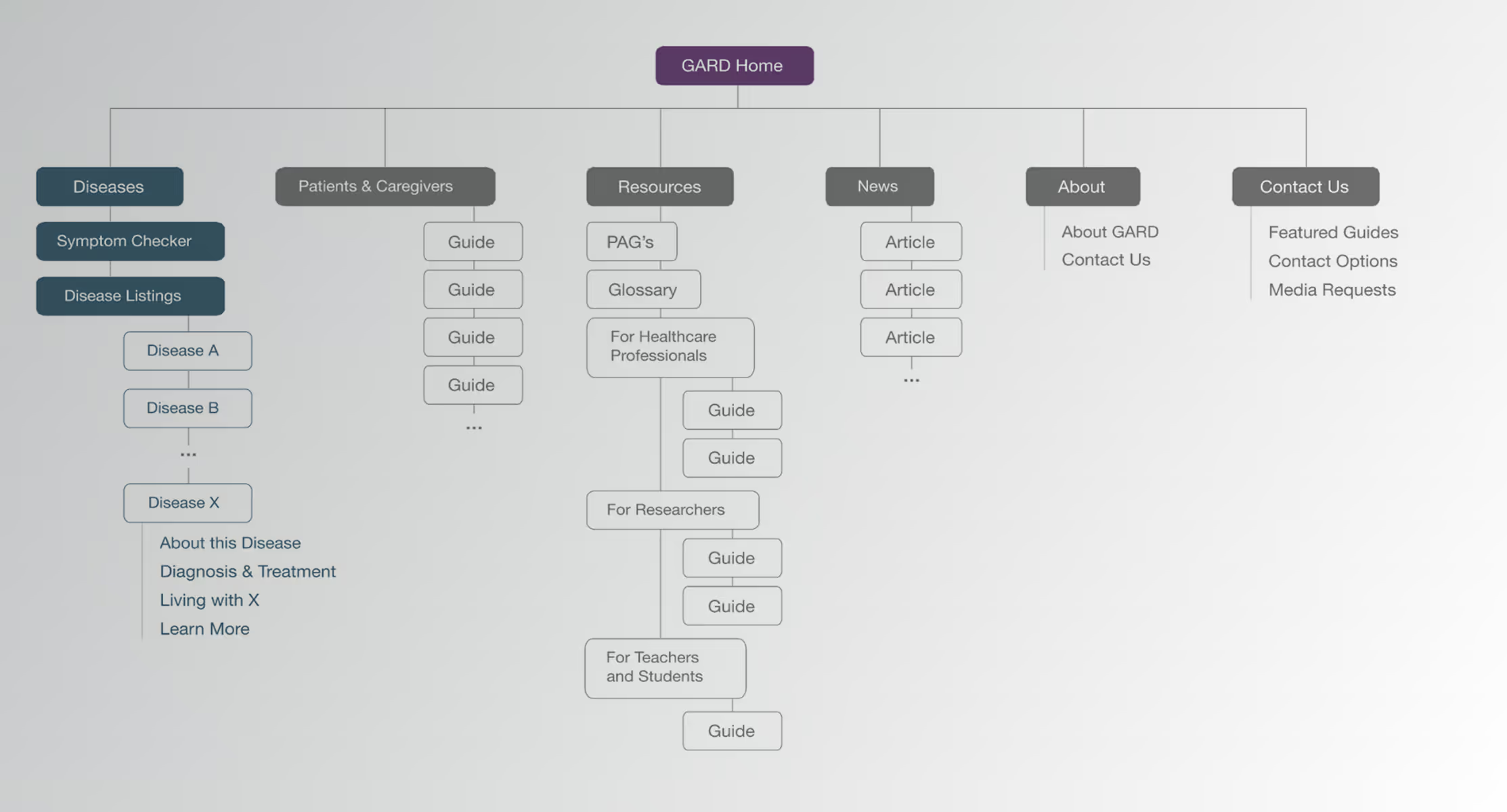
Information Architecture
We consolidated over 50 fragmented pages into four scalable flows.
Outcomes
Navigation shifted from fragmented to structured and intuitive.
60% reduction in navigation complexity
Centralized resource access
Clear, predictable content hierarchy
Topic clustering to restore SEO authority
Improved task predictability
Interaction Design & Content Simplification
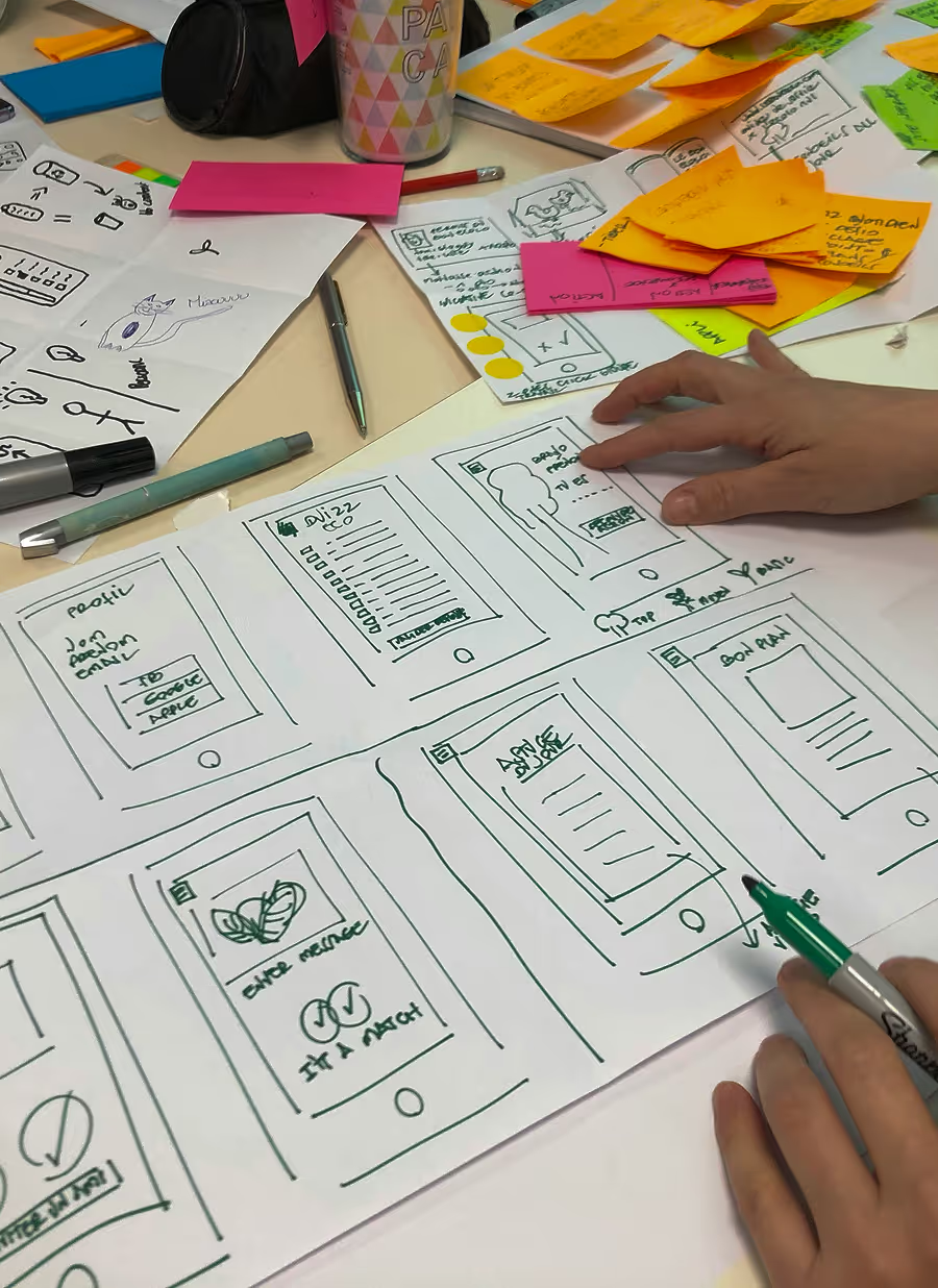
Each iteration cycle followed structured UCD methodology.
Wireframe Exploration
Reorganized navigation around user mental models
Simplified primary flows
Validated disease tab structure
Beta Testing & Refinement
Task-based usability validation
Refined filtering and search
Introduced collapsible content to reduce overload
Production & Governance
Delivered accessible high-fidelity UI
Standardized components across thousands of pages
Embedded analytics tracking
Implemented accessibility validation checkpoints
Every cycle included prototype testing, stakeholder review, and metric validation.
Design System & Accessibility Foundation
I owned and governed the complete GARD 2.0 design system.
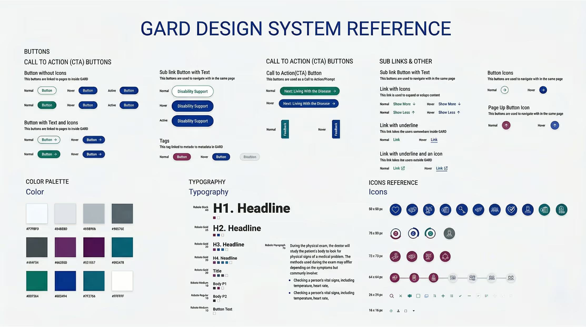
Governance Principles
Accessibility-first components
Responsive grid system
Plain-language content hierarchy
Print-optimized layouts
Structured tab patterns
Scalable component documentation
Section 508 & WCAG 2.1 AA Compliance
Semantic content structure
Screen-reader–compatible markup
Keyboard navigation validation
Accessible color contrast ratios
ARIA labeling where required
Pre-release accessibility audits
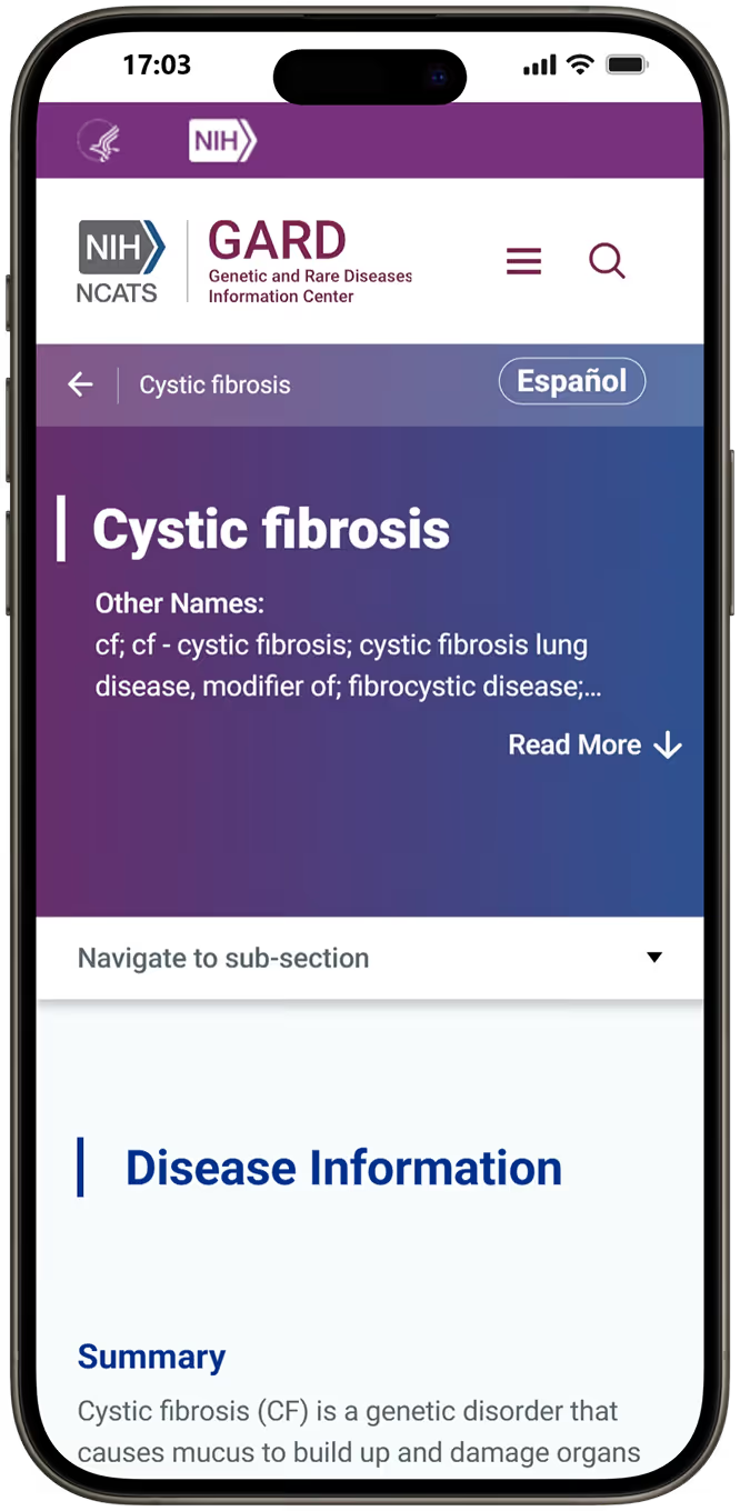
Responsive Design Strategy
With 55%+ of traffic from mobile devices, we adopted a mobile-first framework.
Responsive grid across breakpoints
Optimized print functionality for caregivers and clinicians
Collapsible content optimized for small screens
Touch-friendly interaction targets
Cross-device usability validation
Mobile readability testing
The result: Seamless cross-device performance with measurable mobile growth.
Outcomes & Organizational Impact
Quantitative Performance (4-Month Comparison)
+11.5%
+10.4%
+2.9pts
+11s
+10%
+10%
90%
Qualitative Impact
"The site redesign is fantastic — integrative and patient-focused."
"Dramatic improvement."
"The information is clear and easy to find."
Business Value Delivered
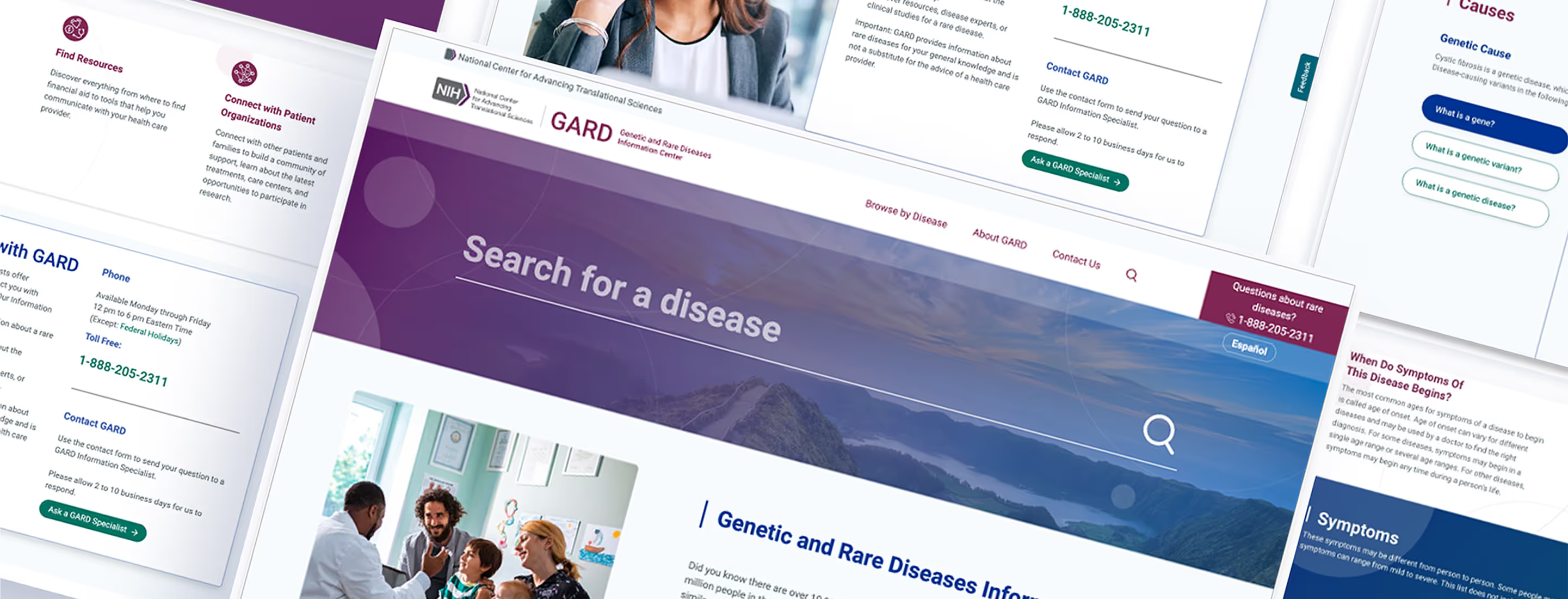
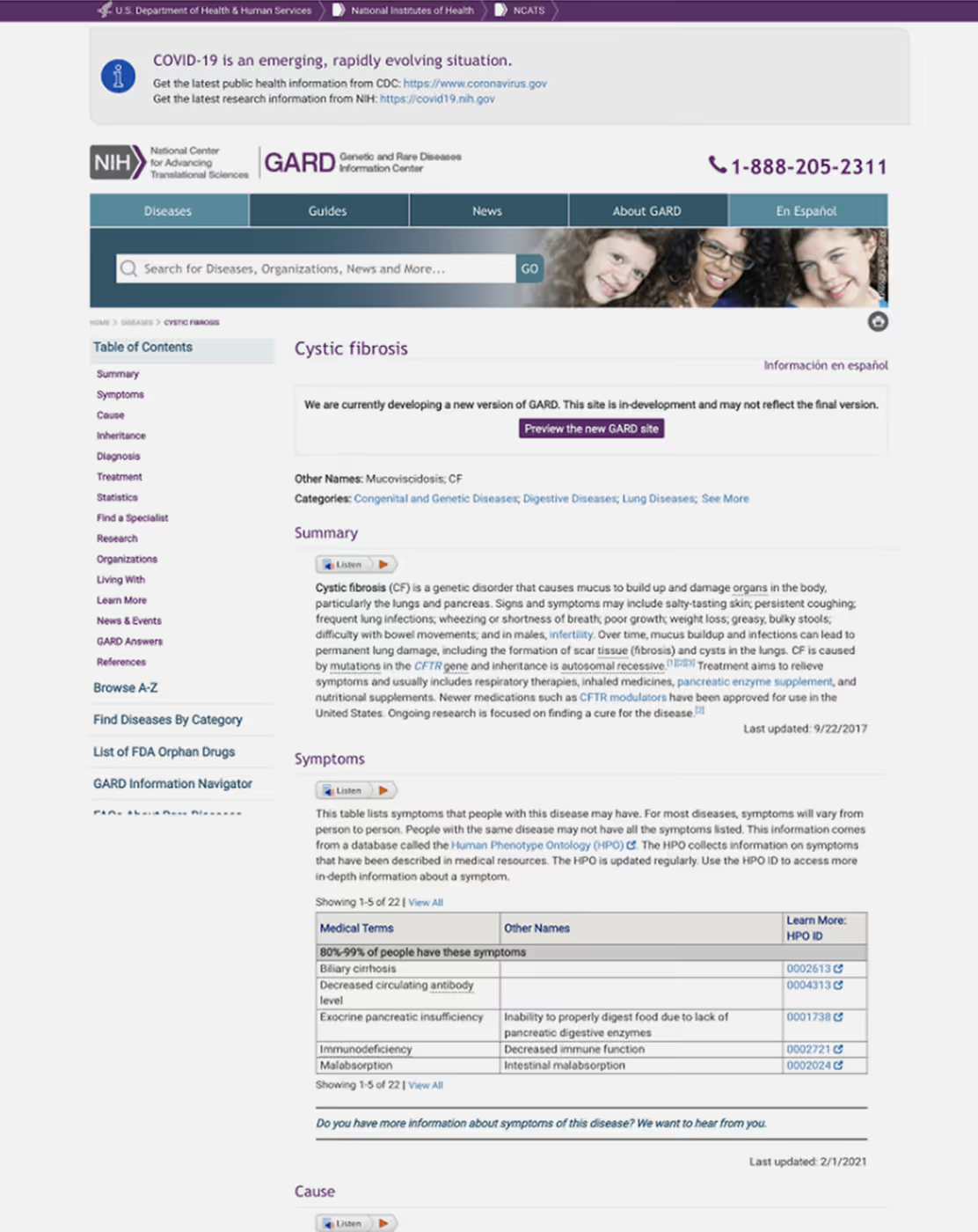
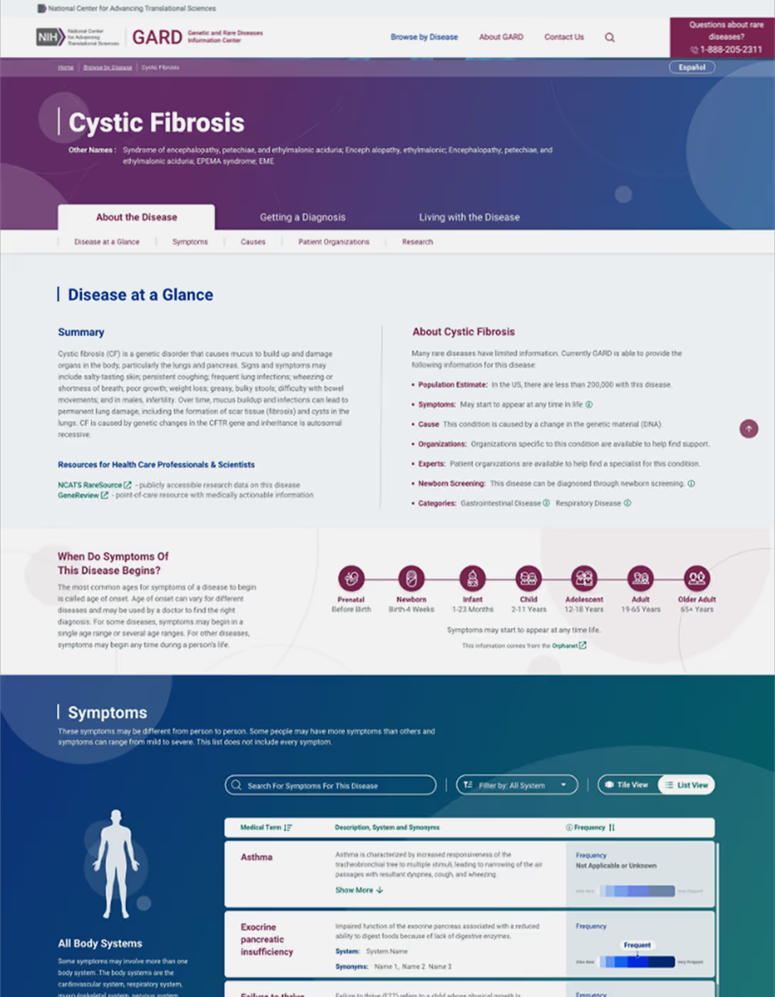
Visual Transformation
What This Work Demonstrates
This project reflects my ability to
Lead multi-year UX transformation in federal health systems
Translate research into measurable public impact
Govern accessibility at architectural scale
Align analytics, SEO, and UX strategy
Build and manage high-performing research and design teams
Establish sustainable design governance models

By embedding accessibility, clarity, and measurable performance into GARD’s architecture, we transformed a fragmented legacy system into a responsive, patient-centered digital ecosystem serving millions with trust and confidence.

If you're building complex platforms, modernizing systems, or strengthening UX leadership, I'd welcome connecting.
